
PAGES
PRESS
BUY THIS BOOK
ROOM REDUX
PLAY WITH
PALETTES
 |
 |
 |
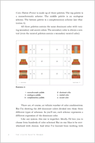
Click an image for a larger version.
Introduction Page 1
Color is the backbone of decorating. Whether you're painting walls, staining floors,
choosing fabrics, or buying carpeting, color comes into play in nearly every decorating
decision. Yet too often color is neglected, misused, and misunderstood. If you've
ever wondered how selecting a color could be so difficult, you're not alone. Even
trained designers tend to fall back on whites and neutrals because they're intimidated
by the overwhelming world of color. And it's particularly easy to fall out of your comfort
zone when you're trying to decide if two or more colors go together — which is virtually
all the time because colors never stand alone. But, in truth, it is just as unreasonable
to expect yourself to pick a perfect palette as it would be to sing a Callas-caliber aria.
Unless, of course, you happen to be a professional opera singer. We've all known
someone who can hear a note, identify it immediately, and then sing it with perfect pitch.
Surprisingly, there are people who can do the same with color. They are able to identify
hue, value, and chroma — color's equivalent to notes, chords, and scales — with amazing
accuracy. While I can't sing on key, I do happen to enjoy a natural ability to compose
palettes that invite people in and ask them to stay awhile. In fact, working with color is my
singular passion, and my hope is that The Color Palette Primer will provide color-phobic
amateurs, sophisticated professionals, and everyone in between with an easy reference
for creating a harmonious environment.
![]()
| INTERIOR DESIGN | COLOR CONSULTATION | BOOKS | BLOG | CONTACT |